Print Advert
These are the first photographs we took for out print advert, however we did not use these becasue our model had to much around her neck and the make up was not drmatic enough.
This is how we intended to create our print advert, but it did not work as well as our final print advert method.
These are the photographs we took to create our print advert.
We used these two to merge together so that there was an evident difference in skin tone.
In order to create our print advert we used www.channel4.com/about_c4/styleguide and http://www.4creative.co.uk/flash/#/print/press_and_poster/ for research, to find the channel 4 logo which we included on our print advert. But we changed the colour of the four to purple so it matched the rest of our text.

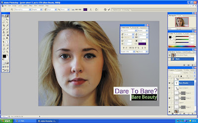
We created our print advert in Photoshop,this is the photograph we made by merging two photos together.
We then added a white box and created our text so that it matched the graphics on our documentary.
We then made sure the text font and colour was the same as the graphics from our documentary.
We then added all three boxes and all the text so that it followed the codes and conventions of a print advert for Channel 4.
We then added the channel 4 logo but we changed the colour to purple so it matched all our over typefaces on our print advert.
This is our second version of our print advert we changed the auto levels and contrast so that the picture appeared brighter and so our model appeared to have a healthier glow.
After looking at the second version with my group we decided that there wasn't a dramatic difference in our models face so we selected the left side and moved the brightness and contrast levels down so that her skin appeared more blotchy and dull. We then selected the right side of the photograph and moved the contrast levels up in order to give our model a healthier glow.
We then decided we wanted to make our model look as if she had bags so we used the lasso tool and drew a crescent shape underneath her eye and moved the contrast levels down.
However after doing this we realised the "bag" looked more like a black eye and that is not the image we wanted to create so we un did that layer.
We then looked at other channel 4 print adverts and realised our title and date where on the wrong side of the screen so we moved them to the left so the channel 4 logo was solo on the right.
This is then the final version of our print advert.
This is our first version of our print advert but the image was not striking enough.
This is our final version of our print advert.


No comments:
Post a Comment